Lesson 2: The Terminator (Line)
2023年7月25日

School of Athens by Raphael
There’s a lot of people in this scene, but you know exactly where to look at. How?
They may look very different, but this painting shares the same concept:

Large simple areas of rest make your eyes want something complicated. Areas that are complicated make your eyes want to rest on something simple. By interleaving them together, we push and pull the eyes to follow invisible lines around the picture. The goal of the artist is to carefully craft the place where the gaze ends up.
Regardless of whether we’re drawing a crowd scene of philosophers or a single portrait, we use areas of rest and areas of complexity to drive the attention of the picture to the important parts. Usually a picture has only one, this is called the “focal point.” You can think of it as the central argument.
As a child, I owned the puzzle set for School of Athens. I repeatedly took it apart and put it back together. Even though I didn’t understand at the time what artistic principle I was looking at, I noticed that some pieces were always easier to locate than others. For example, Plato and Aristotle (in class, I incorrectly identified Aristotle as Socrates, sorry!) sit on the vanishing point, as well as the point of highest contrast for the painting, so they were always easy to place. In comparison, the ceiling was always very hard to assemble. The center is the vanishing point, the focal point, and the point of highest contrast and saturation. The artist really wanted you to understand his central argument.
When you have these two focal points, they compete for priority. Notice the jewelry and the face here, competing for your attention. This is caused by the visual complexity in the jewelry

If you continue ramping up the visual complexity of the jewelry, at some point, the subject of the painting will change, back to one focal point, on the hairpin. (Perhaps you could use this to sell a fancy hairpin)

It’s all about the relative hierarchy of the objects in the scene.In the end, it depends on the kind of story that you want to tell.
Compared the picture below to the two pictures above. Curiously, it is organized in terms of rest areas and complex areas: it pushes and pulls our eyes, but since there’s no focal point, it’s hard to tell what is going on at a glance. There’s no location where our gaze rests.

The garden of earthly delights, Hieronymus Bosch
Why is this picture so strangely organized? It’s function is a clue to its presentation. This painting is a secular triptych. Meaning, it’s a piece of furniture, a medieval home entertainment system of sorts. It doesn’t rely on first read impressions: it has a lot of little details that you can only see when you step close to it, unlike Raphael’s painting, which is all the way up on a ceiling, or the niji generation, which is meant to hit you at a glance.
Raphael’s organization methods have remained timeless. In contrast, you rarely see paintings organized like Hieronymus Bosch’s these days: the general modern principle is that the first read must convey a strong focal point: people simply don’t have the time for a second read.

I’ve always thought this picture was funny, because it is a list of all the things you ought not do, but listed in extreme detail: (“you definitely should not stick a bouquet of flowers into somebody’s butt, certainly not like the way I have demonstrated here.”) I’m sure whichever medieval family owned this piece had some amusement over this.
When it comes down to it, there are many possible ways to organize a painting. After all, tastes change with time and function. We’ll teach many of these in this course, but today, we’ll focus on a single one. Remember, our job is to create a focal point, so we can safely convey our idea from our minds to the minds of our audience.
💡
The most tried and true method of organization in human history is this: shove all the mess to one side of the room, and keep the other side clean.
This first visual organization concept we will explore is value, which is to say, organization by brightness.
To establish a value structure, we will sort the brightness into our picture into 2 buckets, either light or dark. The very important line which separates dark into light is called the terminator line.

💡
Divide your picturing into two tones, using a terminator line. Draw details only on one side of the terminator line, not the other.
Rendered light - emotional, mysterious scenes

Carravagio’s st. jerome
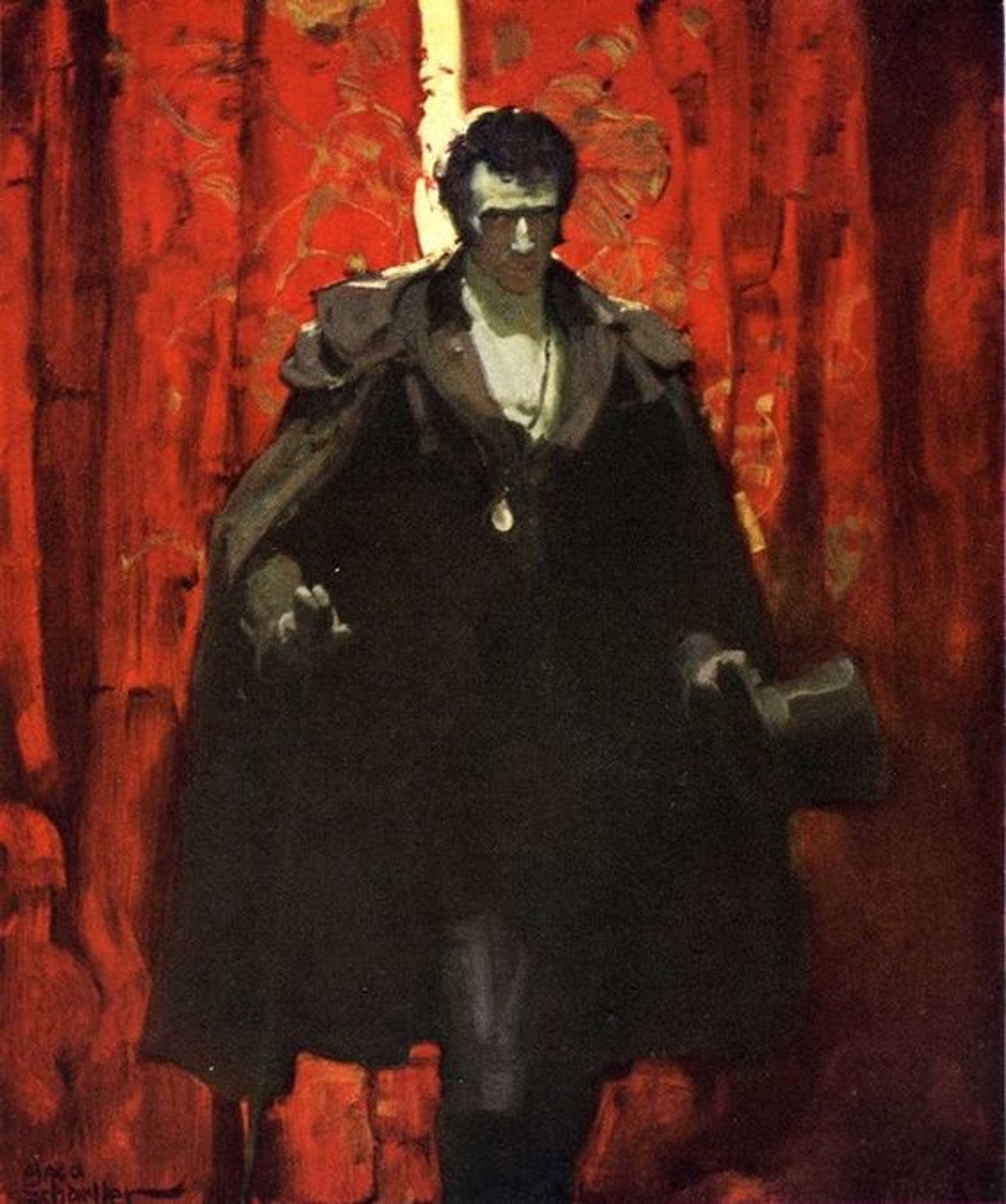
Mead Schaeffer’s Monte Cristo

Mead Schaeffer’s Monte Cristo

dean cornwell
You can also do it the other way around:
Rendered shadow - comforting, soft moments

from illustrator washanapple
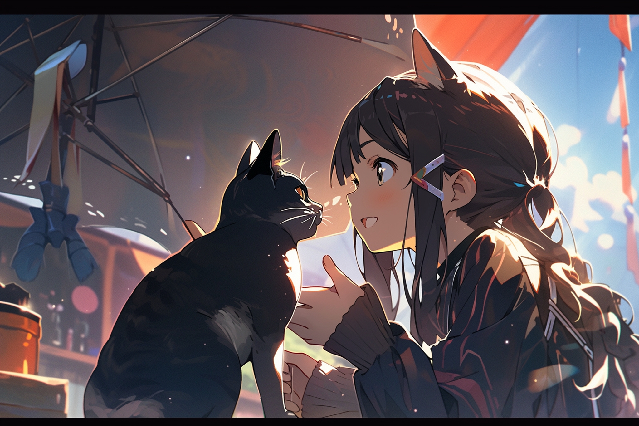
niji likes rendering on shadow
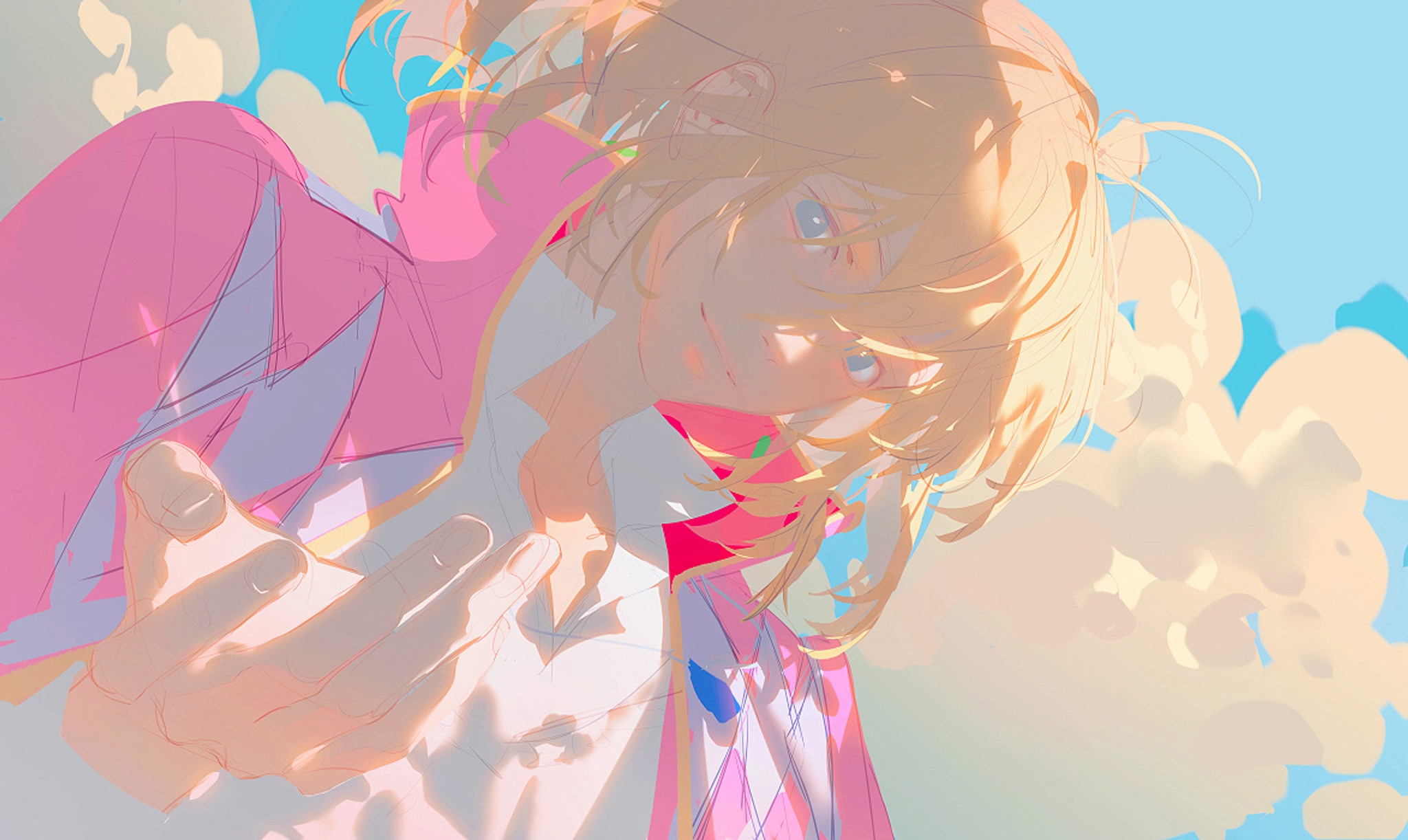
Unusual: anime girls with rendered light

from illustrator REDUM
Actually, when you can sculpt a perfect terminator line, you don’t need to render very much.

The hatsune miku music box, illustration by rella
Rimlight is this form of organization, taken to the extreme.
The elegance of rimlight

from illustrator washanapple
The majesty of rimlight
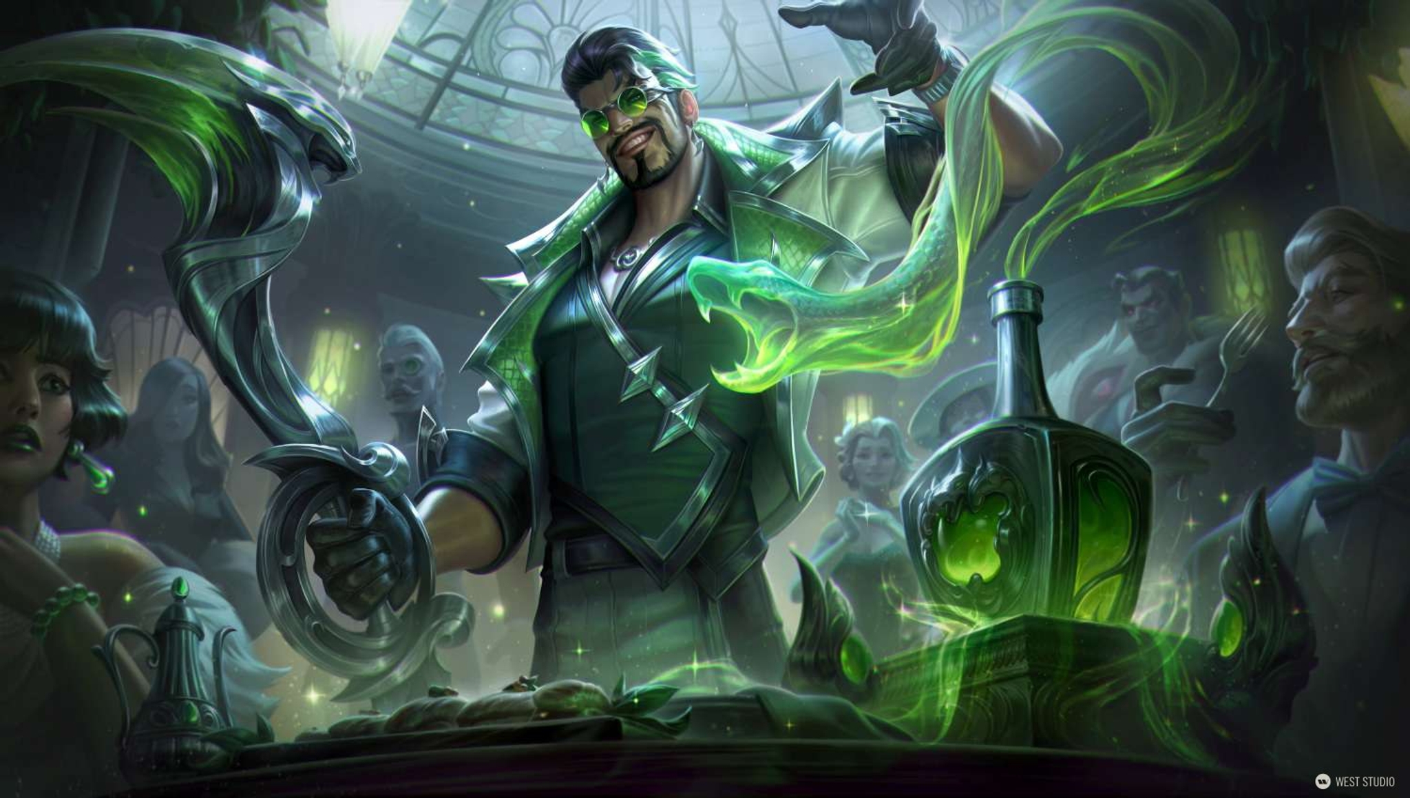
league of legends debonair draven splash art
The power of rim light!

monster university concept art
niji loves rim light

(I’m sorry, niji users)
Rimlight is a little bit overdone, I admit, but it is very convenient
Complicated compositions like this rely on adhering to value organization in order to read well. By keeping the terminator line and the light side clean, the artists here can fill the rest of the picture with detail without overwhelming the audience.

Cafe Cuties splash art from league of legends
It all starts from the division of light and shadow: You can see the entire painting from the terminator line:

from illustrator cmpovar
The ultimate goal is to draw in a way that doesn’t move from the initial terminator line. Once you organize the hierarchy of a painting, you must not go tearing it back down.


From: illustrator RDJlock
If there’s one study that you take away from this class, let it be this one! It forms the backbone of how we organize information on the canvas.
Remember, drawing is thinking! To convince our audience of a concept, we must first organize it clearly in our own minds!
相关文章
niji・journey
niji・journey 是什么?
欢迎来到 niji・journey。这是一款最先进的 AI 生成器,可以绘制任何二次元风格的图像!本魔法般的工具是由 Spellbrush 与 Midjourney 所共同设计开发的。无论您是在寻找可爱的 Q 版角色还是充满动感的动漫场景,niji・journey 都能将您的想象变为现实。我们迫不及待地想看看您创造了什么!
我们可以在哪里找到您?
如果您是一名 AI 研究人员并且喜欢二次元,欢迎将履历寄至 [email protected]。
如果您是位才华横溢的求知者,可以前往我们的招聘页面上查看其他空缺职位。
如需商业咨询和工作室授权等,请联系 [email protected]。