Lesson 5: Let there be (dynamic lighting, 8k, rendered in octane)
2023年9月29日
This will be the most technical lecture of the series!

By now maybe you’ve noticed something peculiar about the niji lessons. It almost feels as if they were teaching you how to draw backwards. Instead of learning how to draw something, why are we learning how to simplify finished pieces?
Learning via process:
Normally, “how to draw” guides online show you a process. A step-by-step guide to how to draw one final thing.
Methods like this require you to trust the process through which the solution is derived, because you can’t see the result while you are drawing. I am an inherently suspicious person, so we don’t teach a lot of specific processes here.
Learning via observation:
In contrast, in this classroom, I show you many finalized things, and then teach you how to derive more simplified things from it.
The most common failure case of a process-driven approach is the failure to generalize: since you only see one final result, it is hard to derive other, similar results. If you make a mistake in your understanding of the process, you won’t be able to catch the failure case, since you haven’t seen enough final results.
Every person has a different neural network architecture: it’s overwhelmingly more important to learn how to hone your own powers of observation, so you can derive processes by looking at the finals.
Knowledge of many processes are useful, in so far as they show you the list of possible ways to break down a problem. But knowing that you must break down the problem first is the more important skill.

That being said, there is one process-based method which I find extremely useful, and that is the theory of lighting.
We had talked before about value, shape, and color, and how we strive to arrange those elements to lead the eye.
These artistic arrangements are higher-order abstractions: at the end of the day, most of what we wish to draw is still based in reality. Otherwise, we are stuck in the realm of too much abstraction.

picasso’s The Bull
And so, to produce convincing pictures, we combine these conceptual-level arguments with an understanding of how physics works.
Observe this picture:

We know from an abstract standpoint, it would be nice to create some small shapes, to add interest to her face. so we justify the existence of the small shapes by putting a straw hat on her head. When the shapes are the correct color, people assume it to be dappled light.
Having a library of how light works in your head will allow you to fabricate these scenarios to add visual interest to a piece.
Let’s learn about the lighting model of a modern graphics pipeline!
diffuse color is the natural color of the object, without any lighting. It is the color that we say when we look at an object. you could call it the chemical property which is inherent to the object.
[diffuse color]
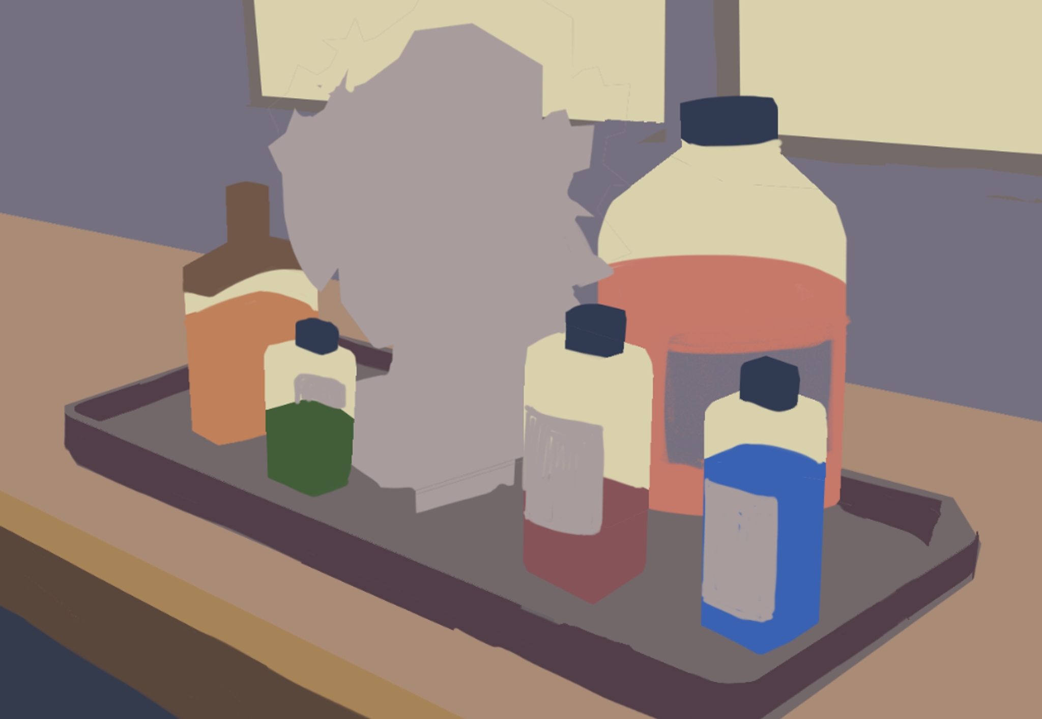
However, depending on the conditions of the environment, objects change color.

Thus far, using observational methods, we have focused on drawing what we see. In other words, we have been replicating the shapes and areas in the picture, while disregarding why they happen. If we see a green area, we draw a green area.
Now, we will talk about the delta, in other words, how and why colors are modified by light, and in turn, how these deltas are modeled by in the modern graphics pipeline.
The first step in rendering is to cast a light on the object.
Counterintuitively, we draw the shadow first, to show the existence of light.
We’ve been doing this since Study 2, in drawing the terminator line. Now, we show you how the exercise is useful in a finalized illustration simply take the black part of the picture and set it to “multiply”, to use it in a colored drawing:
[diffuse color + shadow + cast shadow]

Very aptly named because the two colors get multiplied together, in a mathematical sense, to get the new color
Now, remember, from lesson 3, shadows are not simply a darker version of the diffuse color: to construct the shadow color, we keep the temperature of the painting in mind.
A popular shadow color is blue.
There are many special types of shadows:
A cast shadow is a shadow which results from a different object blocking light from reaching another object.
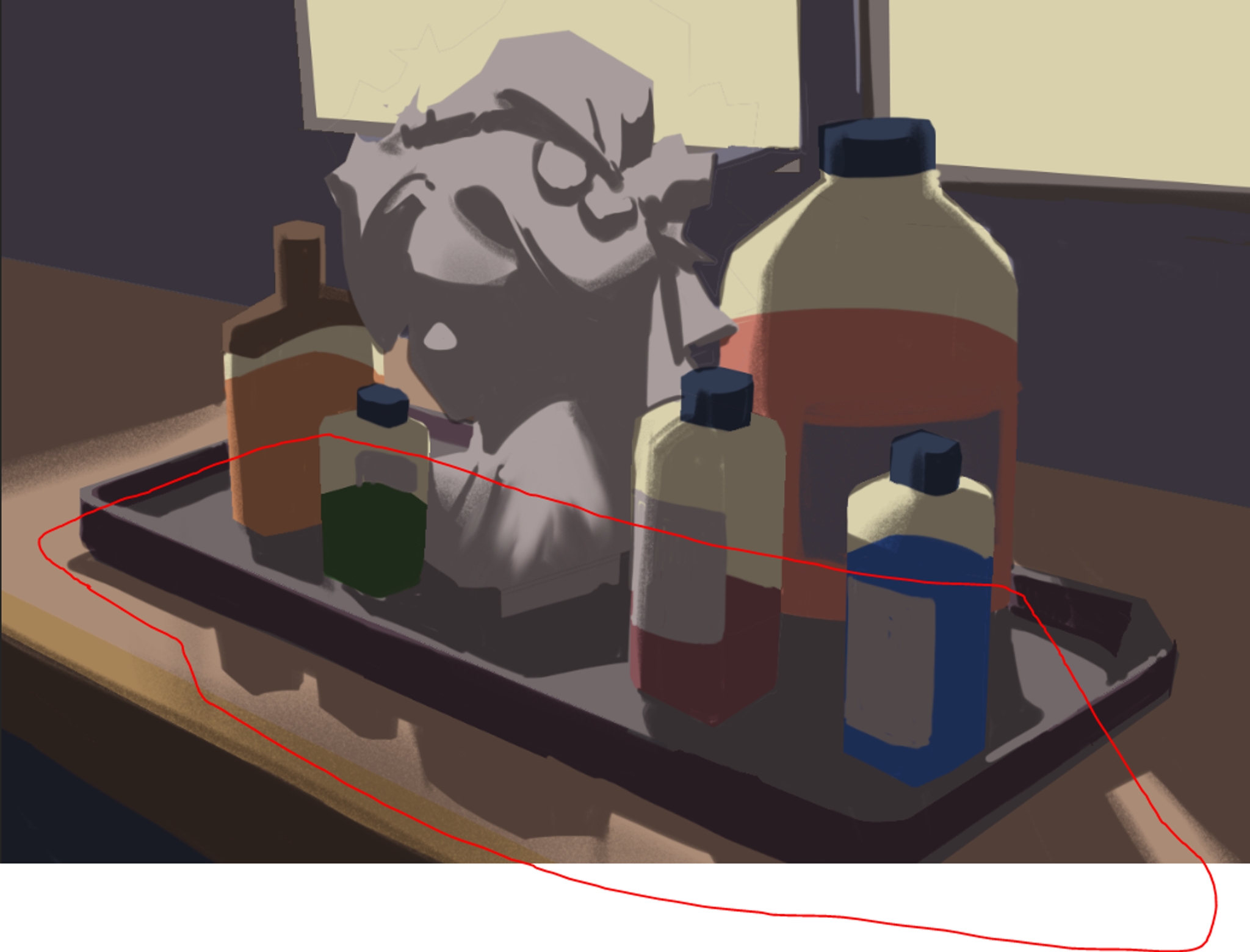
cast shadow can be used for dramatic effect:

A very useful thing to do with cast shadow is establishing the figure-ground relationship. The ground is so big in most pictures that we don’t draw it. Instead, the plane of the ground is often defined by the cast shadows.

in our previous picture, we use it to define the plane of the table.
Ambient Occlusion is the dark area where light never reaches.
[diffuse color + shadow + cast shadow + ambient occlusion]


from unity ambient occlusion documentation
To see ambient occlusion in action
1) Put your hands together, as if you were praying.
2) Leaving your pinkies pressed together, open your palm slightly on the thumb side. Your hands should create a “pocket” shape, sealed on the pinky side, with a small opening on the thumbs side.
3) Hold your hands up to the light and turn it around.
What do you see?
The space between your hands never gets lit, no matter how much you turn your hands. This is ambient occlusion.
Ambient occlusion is especially important in lineart
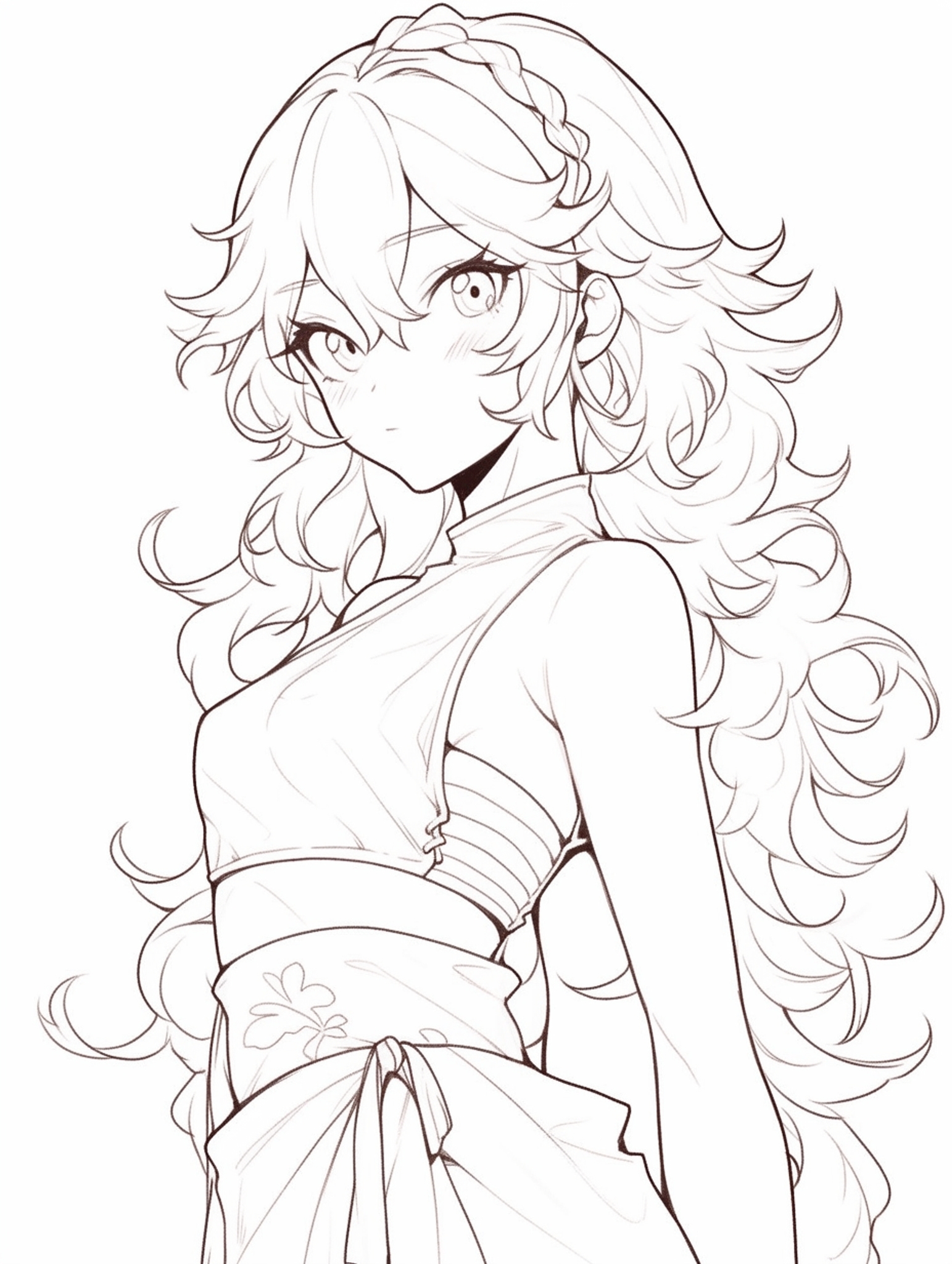
niji
The dark areas, beneath her chin, behind her ears, are very important in establishing “weight” to these lines.
Previously we had defined only shadow and light, via the terminator line.
In this methodology, we can think of the light as a third region.
[diffuse color + shadow + cast shadow + ambient occlusion + light]

This divides our piece into 3 areas: shadow, midtone, and light.
The size of the midtone region characterizes the intensity of the light.
The smaller the midtone area, the more dramatic the light.

The larger the midtone area, the softer the light.

Light is often done as a Soft Light layer.
In the places where the light is extremely bright, we have highlights: regions of incredibly overexposed pure white.
[diffuse color + shadow + cast shadow + ambient occlusion + light + highlight]

Highlights are SMALL and PRECISE.
Think carefully about the placement. Highlights are the cherry on top. Less is more.
The most famous highlight might be the phong shader.
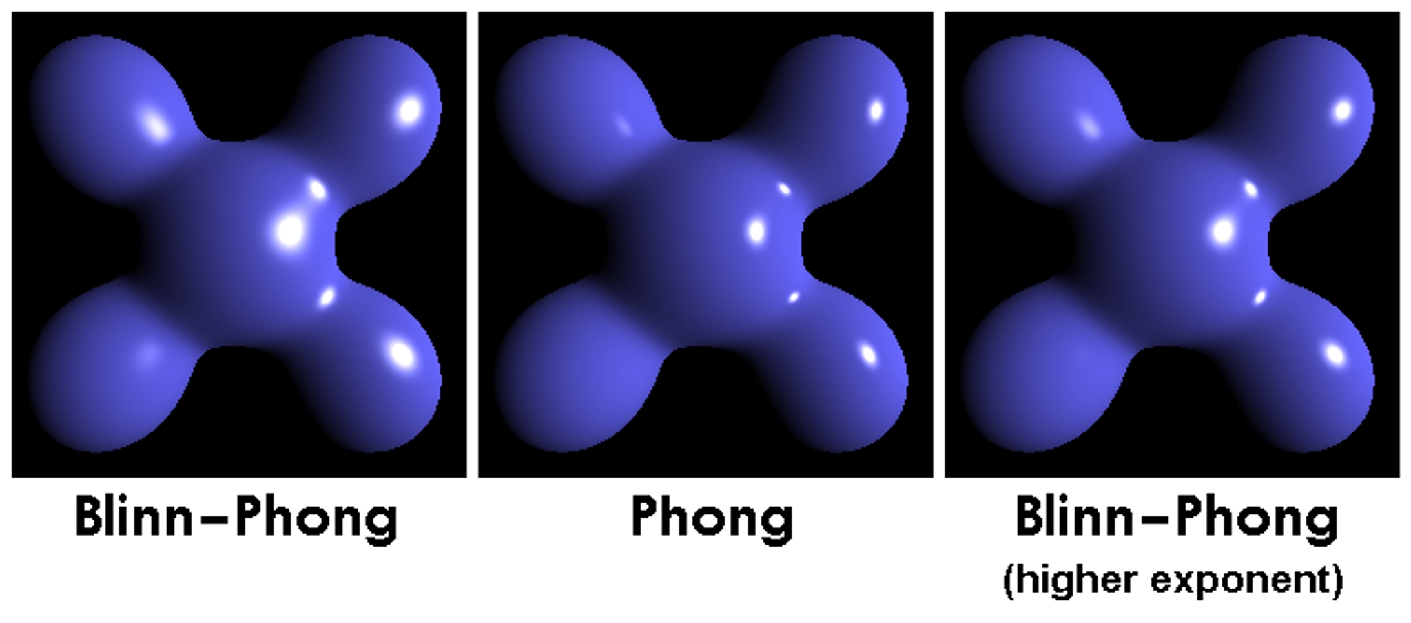
Frequently, this is used in anime to highlight attractive features, like eyes and lips:

niji
Light bounces back and hits the shadow parts. This causes the object to change color.
[diffuse color + shadow + cast shadow + ambient occlusion + light + highlight + reflective light]
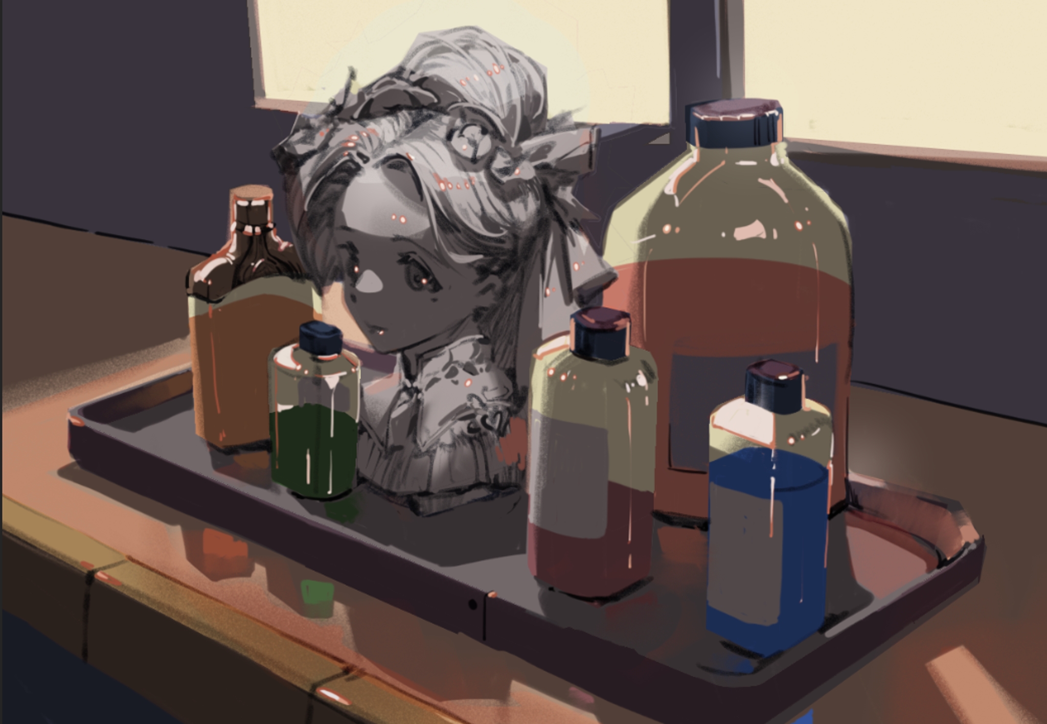
here you can see the strawberries and oranges reflecting on the green balls, adding spots of red and orange to the green.

niji
Objects receive a small amount of light from their environment.
[diffuse color + shadow + cast shadow + ambient occlusion + light + highlight + environmental light]
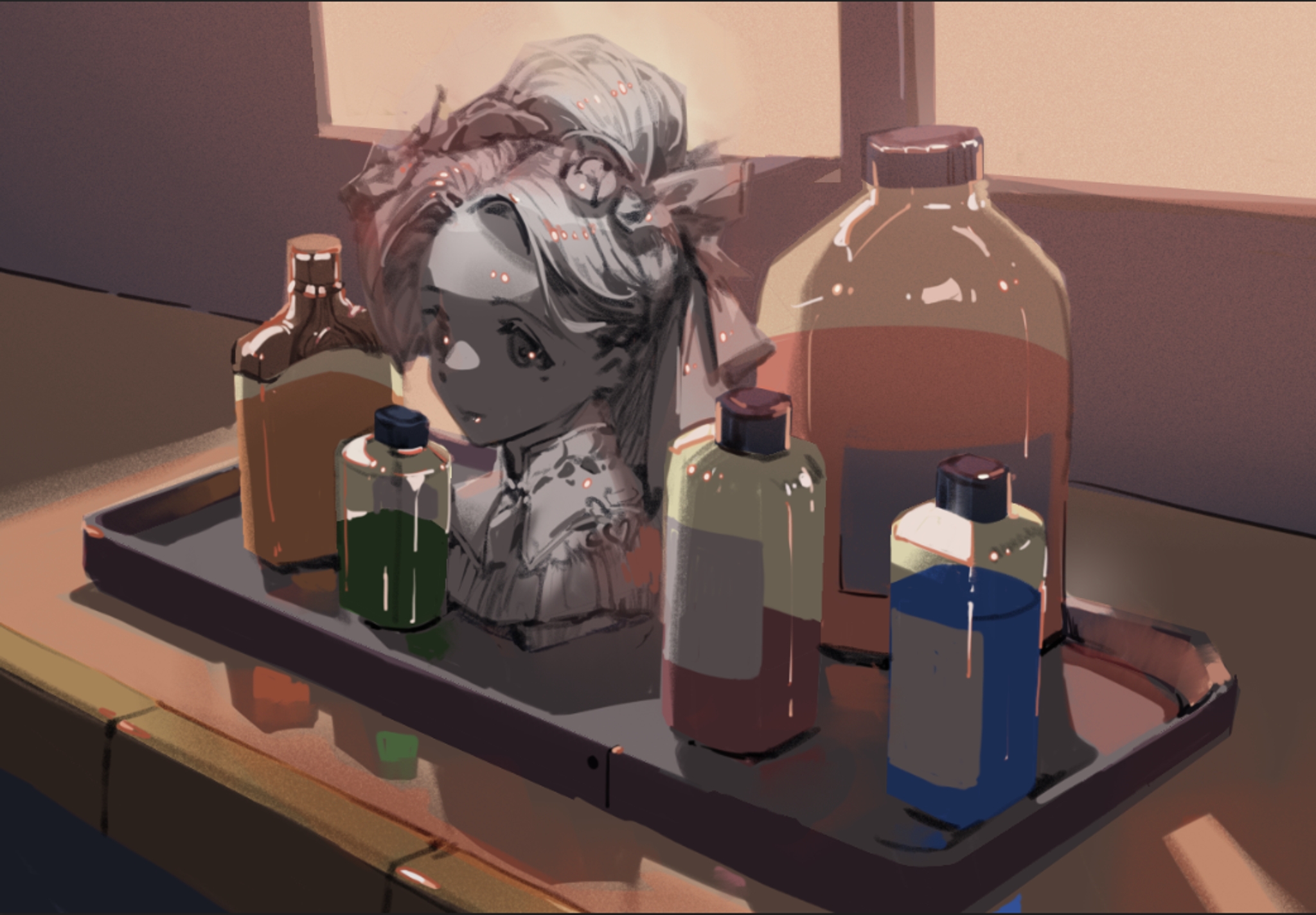
This gets more prominent, the farther away an object is. The farther away apples get bluer and bluer in this picture.

niji
When light passes through certain materials, it is not fully obscured, but rather, partially translucent. Light bounces in the interior of the object, then comes back out.
[diffuse color + shadow + cast shadow + ambient occlusion + light + highlight + environmental light + subsurface scattering]

This effect is particularly useful to remember when rendering skin: the color becomes saturated from the color of the blood vessels underneath skin, and blooms beautiful through.
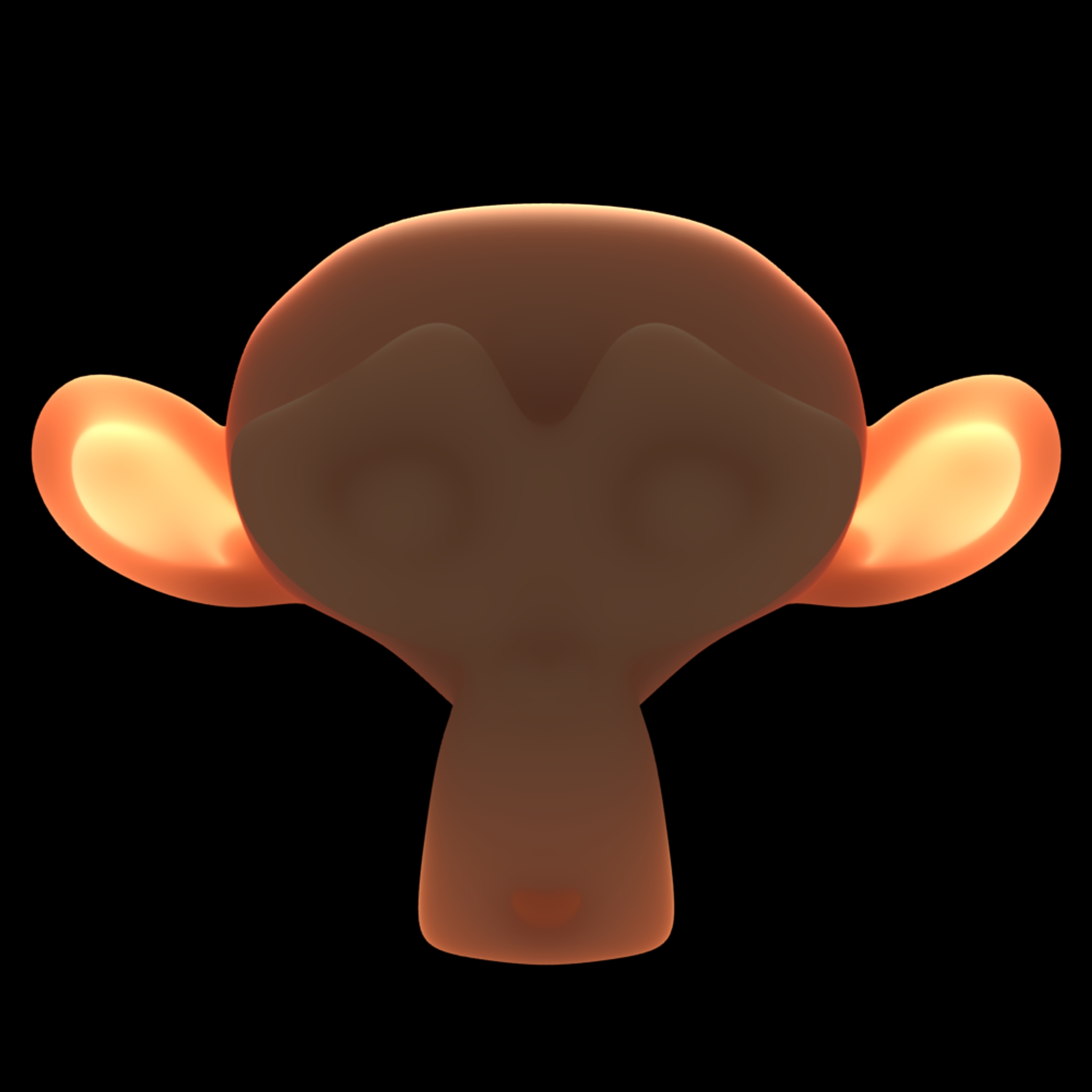
blender monkey, from wikipedia
We talked about this before: it’s a great way to flow the composition, when you need to do something in a hurry.
[diffuse color + shadow + cast shadow + ambient occlusion + light + highlight + environmental light + subsurface scattering + rim light]

Make sure that your rim light is not uniform in width. Make sure that the rimlight matches the slope of the object around the edge.

niji
💡
Caution: It’s very easy to fragment a piece by adding too many elements. Balance is KEY!
It is important to maintain the balance the hierarchy of the piece. Remember, the terminator line is dominant. For example, if we turn up the reflective light here, we’re creating new terminator lines.

We need to be attentive to the relative value of things to have a balanced visual hierarchy
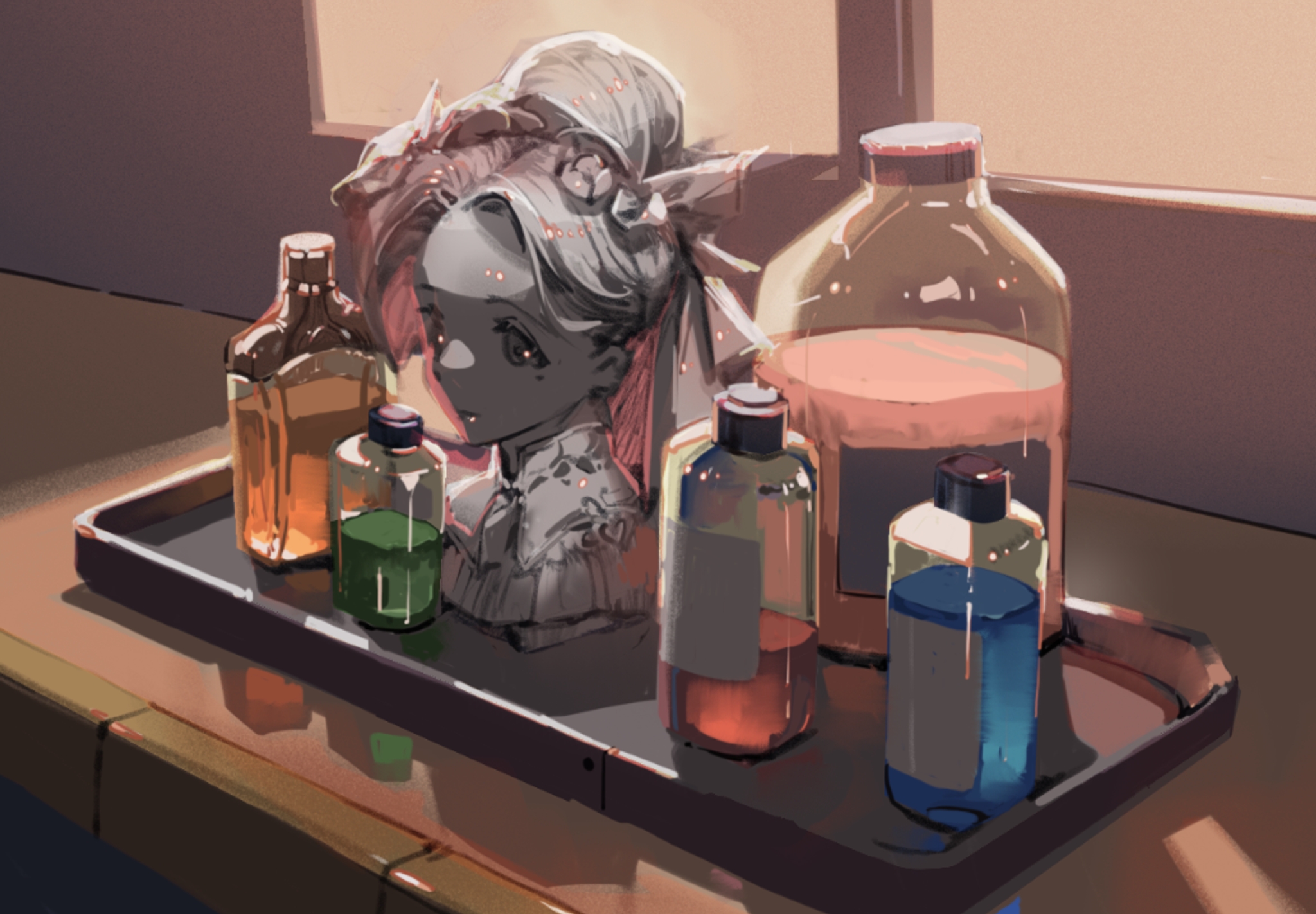
How to put this into practice
1) Know the names of the elements that go into a picture, so you have a library to choose from.
2) Layer them on top of each other, one by one.
3) Make sure that the elements are balanced, and that the central picture remains cohesive.
The study of painting is, in many ways, the stylization of lighting:

niji
Traditionally, computers simulate what happens using these rules.
It takes a very high level of fidelity to convince us of “Truth,” using only these rules. Our brains are trained from millions of years of evolution to detect fakes.
For example, there’s no way that I can convince you this is a real scene.
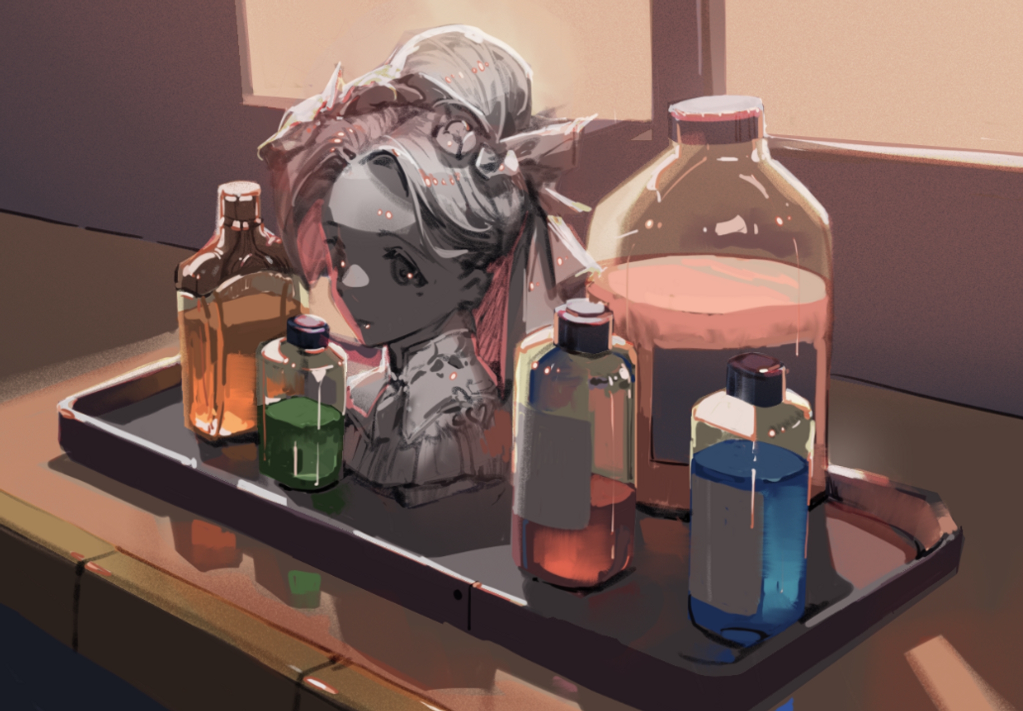
Instead, humans achieve art through simplification.
Here, I have finished the background not in terms of what seems to be correct in the rendering rules, but what I feel would make an impactful visual to my fellow human. The background bottles and jars are mere shapes with a slight bit of shadow, yet, they feel truthful, without any rendering applied.

Instead of modeling every rule perfectly, we design pleasing, abstract shapes, and then use the laws of physics to justify our arguments. You know this isn’t real, but because it’s pretty and shiny, you want to believe in it.
What is fascinating to me is that AI learns the abstract arguments, but has no knowledge of real physics.
AI art is a collective hallucination that only exists in our heads. Isn’t that cool?
相关文章
niji・journey
niji・journey 是什么?
欢迎来到 niji・journey。这是一款最先进的 AI 生成器,可以绘制任何二次元风格的图像!本魔法般的工具是由 Spellbrush 与 Midjourney 所共同设计开发的。无论您是在寻找可爱的 Q 版角色还是充满动感的动漫场景,niji・journey 都能将您的想象变为现实。我们迫不及待地想看看您创造了什么!


我们可以在哪里找到您?
如果您是一名 AI 研究人员并且喜欢二次元,欢迎将履历寄至 [email protected]。
如果您是位才华横溢的求知者,可以前往我们的招聘页面上查看其他空缺职位。
如需商业咨询和工作室授权等,请联系 [email protected]。